
CSS FlexBox Intro

FlexBox is the best tool to create a grid-like layout with CSS. Better than <table> tags, better than inline-block <div>s !
History of table layout methods
Before FlexBox, it was tricky to implement a grid-like layout.
Around 1998, we only had one option to create a grid, <table>.
But styling was limited, and the result was not consistent among browsers.
I remember I had to use the background color of <table> tag to implement 1-pixel width cell borders. Creating a nice looking <table> was a nightmare.
Around 2000, a newer method became popular – <div> with “display: inline-block” technique.
This method was better than <table> tags for styling.
However, not everything about it was perfect. Setting equal cell heights and center aligning cell contents have always been tricky. We had to use far too many CSS lines to make the table look nice.
Around 2010, yet another method became popular – <div> with “display: table-cell” technique.
This was created to solve the “setting equal cell heights” problem with “display: inline-block”.
While this worked better than the older methods, it still had issues such as “min-height not working”.
Then finally, FlexBox came up around 2013.
Useful features
The 2 most useful features of FlexBox are equal height cells and block re-ordering.
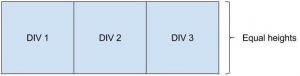
Equal height cells
FlexBox can set equal heights on blocks.
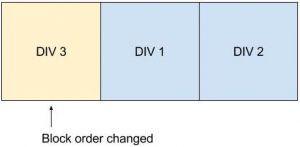
Changing order of blocks
FlexBox can change order of blocks.
Overriding older layout methods
FlexBox is also useful when you have to change an existing HTML structure with older layout methods.
This grid-like layout is created with “display: inline-block” technique.
https://jsfiddle.net/ynakanoendertech/m0htwtL8/embedded/result,html,css/#Result
By adding FlexBox rules, the layout can be changed like this.
https://jsfiddle.net/ynakanoendertech/t5cg6dk7/embedded/result,html,css/#HTML
How to use FlexBox
This is a HTML structure with normal <div>s.
https://jsfiddle.net/ynakanoendertech/k91h98or/embedded/result,html,css/#CSS
To apply FlexBox to this structure, add “display: flex” to the parent <div>. (This will reset the “display” properties on children to be “display: block”.)
https://jsfiddle.net/ynakanoendertech/u31445by/embedded/result,html,css/#HTML
To distribute 3 boxes evenly on one row, add “justify-content: space-between” to the parent <div>.
https://jsfiddle.net/ynakanoendertech/zstxhu8v/embedded/result,html,css/#HTML
To stretch the 3 boxes to fill the row, add “width: 100%” to the child <div>s.
https://jsfiddle.net/ynakanoendertech/8rbsk89L/embedded/result,html,css/#HTML
To horizontally and vertically align box contents, we use nested “display: flex” technique.
Add these 3 rules to the child <div>s:
“display: flex”
“justify-content: center”
“align-items: center”
https://jsfiddle.net/ynakanoendertech/La9y6L46/embedded/result,html,css/#HTML
Summary:
With FlexBox, we can change the normal <div> layout into a grid-like layout with minimal code additions.
For more complete explanation of FlexBox, please refer to: A Complete Guide to Flexbox https://css-tricks.com/snippets/css/a-guide-to-flexbox/
Browser support as of 2017 May
All the modern browsers now support FlexBox, except IE11. For IE11 bugs, refer to the “flexbugs”
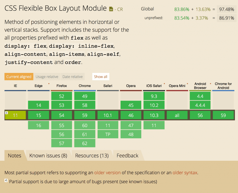
Reference: https://caniuse.com/#feat=flexbox
Grid is coming soon
There is another CSS rule set called “Grid” which is being developed right now.
FlexBox is a 1-dimensional system – row or column.
Grid is a 2-dimensional system – true grid layout.
It will become a better tool than FlexBox to implement a table like layout. However, the browser support is still limited as of May 2017.
Reference: https://css-tricks.com/snippets/css/complete-guide-grid/
References
A Complete Guide to Flexbox: https://css-tricks.com/snippets/css/a-guide-to-flexbox/
Can I Use: https://caniuse.com/
A Complete Guide to Grid: https://css-tricks.com/snippets/css/complete-guide-grid/
Endertech is a Web Design Company in Los Angeles able to provide design and UX solutions for your website development needs. Contact us for your free consultation about CSS.